
That tongue I saw on a stranger’s shirt when I was 18? It did its job. It made me curious. It drew me to the band. It created a connection.
I was 18, walking through my college campus, when I saw it.
A guy walking past me wore a t-shirt with a bright red tongue and lips, no band name, no text, just that image.
I wasn’t into the Rolling Stones at the time. But something about that logo stopped me. It was provocative. Rebellious. Cool in a way I couldn’t quite explain.
That moment, that simple curiosity triggered by a logo on a stranger’s t-shirt, is precisely what great branding does. It draws you in. Makes you ask questions. Creates a connection before you’ve heard a single note of music.
The Rolling Stones’ logo has been doing that for over 50 years. It’s been called one of the most famous logos in rock and roll history.
It all started with a broke art student, a £50 commission, and a torn-out picture of a Hindu goddess from a magazine.
The Commission: A Poster and Something More
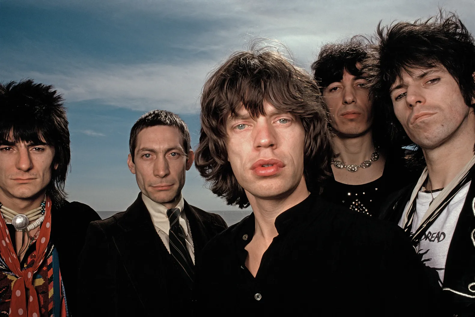
In 1970, the Rolling Stones needed a poster for their upcoming European tour. They were unhappy with the designs offered by their record label, Decca Records. So Mick Jagger approached the Royal College of Art in London, the only postgraduate design college at the time, looking for a young designer.
John Pasche was 25, in his final year of his Master’s degree, and was broke.
“I was a student for nine years, and I needed money,” Pasche later recalled. “I was doing bits of artwork for album sleeves on weekends just to survive.”
His poster design, inspired by 1920s and 30s travel posters, impressed the band. A few months later, Jagger contacted him again with a different request.
They didn’t just want a poster. They wanted a logo. A symbol. Something that could stand on its own without any band images. Something bold that could be used on tickets, letterheads, press books, anything.
Jagger referenced the Shell logo as an example. A symbol so strong it didn’t need words.
Then Jagger showed Pasche something unexpected: a torn-out magazine page from a corner shop featuring the Hindu goddess Kali, with her tongue sticking out.
“I really like this,” Jagger said.
The Design: Rebellion in a Sketch
Pasche went home and spent a week or two sketching.
But the image of Kali’s pointed tongue stuck with him. Combined with another obvious inspiration: Mick Jagger’s own famously prominent lips and the way he’d stick his tongue out during performances.
“The design concept was to represent the band’s anti-authoritarian attitude, Mick’s mouth, and the obvious sexual connotations,” Pasche explained. “It’s the kind of thing kids do when they stick their tongue out at you. It’s an attitude, really. I thought it would work well.”
He drew three different versions from different angles. When he met with Jagger again, the singer immediately pointed to Pasche’s favorite: the one we now know.
Pasche was paid £50 (about $75) for the initial artwork.
The Evolution: From Sketch to Icon
The logo’s first public appearance wasn’t grand. On March 26, 1971, it showed up on VIP passes for a Rolling Stones concert at London’s Marquee Club.
A few weeks later, it appeared on the Sticky Fingers album, on the record label, the back cover, and most prominently on the insert inside the gatefold. This was the Rolling Stones’ first release on their own label, Rolling Stones Records, free from their previous record company.
But there was a problem.
The artwork needed to get to New York quickly for the American release. Pasche had only completed rough sketches. His design was faxed to the United States on a thermal fax machine. “The quality is just shit,” as American designer Craig Braun later described it.
Braun and his team at Sound Packaging Corporation had to redraw it. They narrowed the tongue, added more white around the lips and tongue, added black to highlight the throat, and made the design more aggressive.
“It’s unfortunate,” Pasche said decades later. “That’s the predominant design now. People might not be able to tell the difference, but it meant quite a lot to me.”
Braun’s modified version, slightly different from Pasche’s original, is the one that appears on tour merchandise, t-shirts, and licensing deals to this day.
The bright red color? That came later, added by an Atlantic Records executive.
The Business: Copyright, Regret, and Millions
Initially, the logo wasn’t a huge deal.
“It was going to be for their letterheads, new label, small uses really,” Pasche said. “It grew to be a lot bigger than that.”
A year or two after the initial £50 payment, the Stones sent Pasche an additional £200 “just to say, ‘we should have paid you a bit more, really.’” They also offered him a percentage of merchandise sales.
But in 1984, the situation changed.
The Rolling Stones wanted to buy the copyright outright. At the time, there was a gray area in copyright law about “usage rights.” If a company had been using something for years and recognized it as part of the company, they could claim ownership.
Pasche’s lawyer advised him: “It’s a bit of a grey area, and you could lose out on this one going against the Stones.”
Pasche negotiated a settlement: £26,000 (about £80,000 in today’s money).
“At the time, I was quite happy with it,” he said. “It was enough to buy my initial small flat in Muswell Hill, which kicked me off on the property ladder. Obviously, I regret it, but there was a good reason why I did it.”
After acquiring full copyright, the Stones really went to town on the merchandise. It obviously has brought in millions for them over the years.
In 2008, London’s Victoria and Albert Museum bought Pasche’s original artwork for £51,000 ($92,500). The Stones later permitted him to sell limited-edition prints of his original design, now his primary source of income at 78, for about £2,500 each.
The Impact: More Than Just a Logo
Today, the Rolling Stones tongue is everywhere.
T-shirts. Lighters. Mugs. Caps. Fire lighters. Hoodies. Water bottles. Acrylic sculptures. Neon signs—even LEGO sets.
In 2023, it appeared on Barcelona football players’ jerseys during El Clásico to promote the band’s new album, “Hackney Diamonds.”
The logo has been updated over the years for special occasions. Shepard Fairey redesigned it for the band’s 50th anniversary in 2012. After drummer Charlie Watts died in 2021, the band changed their tour to black in his memory.
But the basic design remains unchanged: a tongue. Red lips. Attitude.
The accolades speak for themselves:
Named the #1 Most Iconic T-Shirt Design of All Time.
Called the Best Band Logo in History by Tailor Brands.
Listed among the top 15 commercial logos of all time by Creative Review.
The Sticky Fingers album cover (featuring the logo) was named #1 Greatest Album Cover by VH1 in 2003.
As music writer Sean Egan wrote: “Without using the Stones’ name, it instantly conjures them, or at least Jagger, as well as a certain lasciviousness that is the Stones’ own. It quickly and deservedly became the most famous logo in the history of popular music.”
Victoria Broakes, head of exhibitions at the V&A, put it: “The Rolling Stones’ Tongue is one of the first examples of a group using branding.”
The Anatomy of an Iconic Logo
What made a simple sketch worth millions?
It’s Instantly Recognizable.
No text needed. No band photos. Just a tongue. You see it from across a room, and you know: Rolling Stones.
It’s Simple
Pasche designed it to be “easily reproduced, and in a style he thought could stand the test of time.” It works at any size, from a tiny record label to a massive stadium backdrop.
It Has Attitude.
It’s provocative. Sexual. Anti-establishment. It captures the essence of rock-and-roll rebellion without saying a word.
It’s Versatile.
The logo has been adapted countless times for various tours, albums, and occasions, yet it remains recognizable while maintaining flexibility within a consistent framework.
It Represents the Band Perfectly
Mick Jagger’s lips. The band’s defiant attitude. Rock and roll sexuality. It’s the band’s essence distilled into a symbol.
Ask someone under 30 if they know the Rolling Stones. Many will say no. Show them the tongue logo? “Oh yeah, I’ve seen that everywhere.”
The logo has become bigger than the band itself, a symbol of an entire era and attitude.
Lessons for Independent Musicians
Can you, as an independent musician, create a logo worth millions?
Maybe not millions. But here’s what the Rolling Stones logo teaches:
Invest in Professional Design
Mick Jagger didn’t ask his friend to doodle something. He went to a design college and hired a talented student. Even £50 in 1970 was an investment.
Your logo will appear on everything: albums, merch, social media, posters. Make it good.
Simple Beats Complex
A tongue. That’s it. No elaborate artwork. No fancy effects. Just a bold, simple image that works at any size.
Your logo should work as a tiny profile pic and a massive banner, simplicity scales.
Make It Reproducible
Pasche specifically designed the logo to be “easily reproduced.” Think about how your logo will look:
Printed on a t-shirt.
As a social media avatar.
On a poster.
Embroidered on a cap.
In black and white (if needed).
If it only works in one context, it’s not a strong logo.
Represent Your Attitude, Not Just Your Name
The Stones didn’t want their name in the logo. They wanted a symbol that captured their essence.
What’s YOUR band’s attitude? Rebellious? Melancholic? Energetic? Mysterious?
Your logo should communicate that visually.
Own Your Copyright (If You Can)
Pasche’s story is a cautionary tale. He created something worth millions but sold it for £26,000.
If you commission a designer, make sure your contract clearly states you own the copyright. Don’t let gray areas cost you later.
Consistency Builds Recognition
The Stones have used variations of the tongue for 50+ years, but it’s always recognizable, consistency compounds.
Don’t redesign your logo for every album. Evolve it slightly if needed, but maintain the core identity.
Your Logo Should Work Without Your Name
Can someone recognize your band from your logo alone? That’s the test.
Most band logos are just stylized text. The Stones proved that a standalone symbol can be even more powerful.
The Bigger Picture: Branding Before Branding Was Cool
In 1970, rock bands didn’t think about “branding.”
The Beatles had their stylized font on Ringo’s bass drum, but the idea of a rock band commissioning a piece of visual art that didn’t include any lettering, that could stand alone as a symbol, was revolutionary.
The Rolling Stones were pioneers.
They understood something that most musicians still don’t: Your visual identity is as important as your music.
People will wear your logo on a t-shirt. They’ll get it tattooed. They’ll recognize it before they remember your band name.
That tongue I saw on a stranger’s shirt when I was 18? It did its job. It made me curious. It drew me to the band. It created a connection.
That’s what great branding does.
You need A clear sense of your band’s identity and attitude
A willingness to invest in professional design (even if it’s a talented student on Fiverr or Behance)
A simple, bold concept that represents your essence
The discipline to use it consistently across everything
Your logo is an investment in your band’s future.
Make it count.
What’s your band’s logo? Does it capture who you really are? Please reply and let me know.